• You've discovered RedGuides 📕 an EverQuest multi-boxing community 🛡️🧙🗡️. We want you to play several EQ characters at once, come join us and say hello! 👋
  • IS THIS SITE UGLY? Change the look. To dismiss this notice, click the X --->
Cannonballdex UI Skin

Software Cannonballdex UI Skin (1 Viewer) 2023-05-18

Download
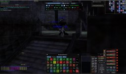
I figure when you play long enough you don't really need the title of the windows. Likewise I get so many things open in my GUI that every little bit of trimming helps. Even little things such as shrinking spell icons and buttons. As long as all the information is visible I think it works quite well.
 
ive been a devout default UI guy my whole eq career ... but i have to say i like the simplicity with this one ... do custom UI chew up resources? again pardon the question if its silly. being a default UI careerman leaves me wondering if running it on a mass amount of instances will add to to cpu/gpu load? if not i might just try this out, that being said there is not a hope in hades ill ever be convinced to use luclin models ...
 
ive been a devout default UI guy my whole eq career ... but i have to say i like the simplicity with this one ... do custom UI chew up resources? again pardon the question if its silly. being a default UI careerman leaves me wondering if running it on a mass amount of instances will add to to cpu/gpu load? if not i might just try this out, that being said there is not a hope in hades ill ever be convinced to use luclin models ...
This is the basic default Everquest UI. The only thing custom is things turned off and made smaller. I would guess if anything the resources would be less or the same as the default.

No issues with memory here. :)
 

Attachments

  • Untitled.jpg
    Untitled.jpg
    123 KB · Views: 16
Last edited:
I figure when you play long enough you don't really need the title of the windows. Likewise I get so many things open in my GUI that every little bit of trimming helps. Even little things such as shrinking spell icons and buttons. As long as all the information is visible I think it works quite well.

Looks good.

Question - what resolution / scaling do you use? I find... and this might just be me getting older (UGH).. that while I run 3 monitors while playing EQ, 2x 4K and 1x 2K.. I have a hell of a time reading the text in the hotbuttons on the 4K windows.. But ... when i move a window to the 2K screen, its like FULL of damn windows, and the open "game space" is so limited!

I am having a hard time finding that happy medium, and maybe a custom UI (such as yours) would be the solution...
Going to vary by what monitor you are using. All of my monitors are really old. lol
My windows setting is at 1680 x 1050 and my in game setting is at 640 x 480
 
Software Cannonballdex UI Skin

Users who are viewing this thread

Back
Top