• You've discovered RedGuides 📕 an EverQuest multi-boxing community 🛡️🧙🗡️. We want you to play several EQ characters at once, come join us and say hello! 👋
  • IS THIS SITE UGLY? Change the look. To dismiss this notice, click the X --->
Resource icon

Lua - Player Targ (2 Viewers) v2.04

Download
I don't use isboxer so I am clueless on this issue, please explain
So innerspace/isboxer allows me to view all of my toons at once. They will go into small windows on a second monitor, while the toon I'm focused on will be full screen on my main monitor. When switching back and forth all imgui windows will revert to a different location on the screen, and not where I try to place the windows. However, @Derple might have just fixed this issue, I'll have to wait and see if it works. Basically, if I set this Lua into a certain area on my main screen (focused character), if I brought up another character right quick, and then switched back the window would not be in the same location I had placed it. It is a resizing issues.
 
grimmier,

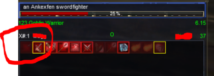
suggestion: knowing what number on XTarget the current mob is, is money. This pic shows, current mob, xtarget position, primary and secondary aggro
1719378634117.png

this was done in XML with MQ2Labels and
1719378827630.png
 
Hey, using this a bit, works well :)
I am interested in splitting the 2 parts back out, to 2 windows, but it seems a bit redundant. Not sure. I was initially thinking of asking if the player bit or the target bit could be turned off, and then being able to create 2 of the windows, and just in one, select player only, in other, select target only? Then they could be linked side by side using the imgui docking functionality.
Also, I wonder if there are options for transparancy available? a bit like EQ's Normal and Fade, or maybe just transparent background so you could see through. These things are always a problem, depending on backgrround colour.

Thanks for the work on all the replacement imgui's, I have the problem mentioned above, re imgui resetting, but not on resize, seems to be on "set to foreground" or "set to background" and stops me using imgui with innerspace/isboxer, which I would use to have a column of boxes down one side of the screen, but due to that behaviout I cannot :(
So instead I am back on the "replace all EQ UI stuff" trail, much like yourself :)

The player part of the window, I quite like the more informational UI versions, you know the type, showing XP / AA / AC / Atk / haste, all those kind of things.
For my usage I actually fancy a player health only (like you have) and a target full info (like you have) at the screen top, because muscle memory, and then would like a more full player info at the "control center" at the bottom, trying to break that muscle memory, and I have the target window there too. Wondering if it's just best to fork/copy what you've done and make some edits and bam, it's another window, or try and find ways / suggest things to make it only one codebase.
I will look into adding some options to split them back apart. similar to how mybuffs lets you split our songs.


For transparency Check out ThemeZ. you can set up your own theme to use and then load that in with playertarg. So you cuold create one for just that window and set your coloring / transparencies.

the extra could also be added, but i would also add toggles for that data, and leave it in the tooltip for hovering when you want to see if it toggled off.

I will look into adding these things just got to get through working today and tomorrow and I will have some time off =)
 
thank you, I appreciate the time put in to these ... extensions ... and having a whole screen full of imgui replacements looks real nice with a lot of them coming from you :)

I have some thoughts about map and quest and quest overlay amd achv window and bazaar searcher but I don't wanna derail this thread ;p
Also are you doing a replacement EQ button with menu? ;)
 
Boxhud (https://www.redguides.com/community/threads/boxhud.77414/) gives an option a bit like I was expecting, for transparency, just seems to set background to transparent. Then themes apply on the top of that.
when you set up a theme in ThemeZ if you right click the color picker you can toggle the alpha bar on. which is your transparency. for a transparent background set WindowBg 's alpha slider to the bottom.


Hey, using this a bit, works well :)
I am interested in splitting the 2 parts back out, to 2 windows, but it seems a bit redundant. Not sure. I was initially thinking of asking if the player bit or the target bit could be turned off, and then being able to create 2 of the windows, and just in one, select player only, in other, select target only? Then they could be linked side by side using the imgui docking functionality.
Also, I wonder if there are options for transparancy available? a bit like EQ's Normal and Fade, or maybe just transparent background so you could see through. These things are always a problem, depending on backgrround colour.

Thanks for the work on all the replacement imgui's, I have the problem mentioned above, re imgui resetting, but not on resize, seems to be on "set to foreground" or "set to background" and stops me using imgui with innerspace/isboxer, which I would use to have a column of boxes down one side of the screen, but due to that behaviout I cannot :(
So instead I am back on the "replace all EQ UI stuff" trail, much like yourself :)

The player part of the window, I quite like the more informational UI versions, you know the type, showing XP / AA / AC / Atk / haste, all those kind of things.
For my usage I actually fancy a player health only (like you have) and a target full info (like you have) at the screen top, because muscle memory, and then would like a more full player info at the "control center" at the bottom, trying to break that muscle memory, and I have the target window there too. Wondering if it's just best to fork/copy what you've done and make some edits and bam, it's another window, or try and find ways / suggest things to make it only one codebase.


I added the toggle to split the windows apart. the target window will hide itself if you do not have a target.
you can shrink the window if you do not want to see the buff's

Added the XTarget Slot Number.
 
Out of curiousity, any idea why some of this text is blurry (target name,etc) and some is clearer (target hp%, player level, its sharper than the screenshot shows)? Is it a windows scaling thing? Thanks !

1719768591648.png
 
Lua - Player Targ

Users who are viewing this thread

Back
Top