Install the app
How to install the app on iOS
Follow along with the video below to see how to install our site as a web app on your home screen.
Note: This feature may not be available in some browsers.
-
 You've discovered RedGuides 📕 an EverQuest multi-boxing community 🛡️🧙🗡️. We want you to play several EQ characters at once, come join us and say hello! 👋
 -
 IS THIS SITE UGLY? Change the look. To dismiss this notice, click the X --->
You are using an out of date browser. It may not display this or other websites correctly.
You should upgrade or use an alternative browser.
You should upgrade or use an alternative browser.
Sic updated Zliz - Sic/Kaen version with a new update entry:
Friends don't let friends use mercs (but i guess)
Read the rest of this update entry...
Friends don't let friends use mercs (but i guess)
- updated this compilation with the newest Sparxx merc window - zliz was originally using a sparxx window
- this returns the ability to switch mercs!
Read the rest of this update entry...
you edit that in mq2targetinfo.ini
Perfect, thank you. I found this post helpful in figuring out what numbers to change. (Side note, I would have thought the "TargetInfoAnchoredToRight" setting would be what I wanted to change...it was not.) Thanks for pointing me in the right direction.you edit that in mq2targetinfo.ini

Figured this out. Looks like the Actions window was minimized in the default UI, and for some reason that caused it to just not show up at all when I loaded up the Zliz UI.
So glad I randomly found this thread browsing, this UI is *almost* exactly what I was looking for. For a very long time. Thank you!
yea, I can't explain it without a visual but I LOVE Zliz and Sparxx and wish there was a combo with each. My favorite window from Zliz is the "Character -> Player Information" window (not sure which xml this is at the moment..) and the rest of the Sparxx UI. Maybe @Sic or @ChatWithThisName can comment on this?
-Taz
EQUI_PlayerWindow.xml is that file
I use a custom mash up of Sparxx and Zliz also
SAME!!!! I would love a combo of both and thought about this quite some time ago.yea, I can't explain it without a visual but I LOVE Zliz and Sparxx and wish there was a combo with each. My favorite window from Zliz is the "Character -> Player Information" window (not sure which xml this is at the moment..) and the rest of the Sparxx UI. Maybe @Sic or @ChatWithThisName can comment on this?
-Taz
yup. created a new folder, copied all the Sparxx files into it, then copied the Zliz EQUI_PlayerWindow.xml into it.
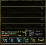
To fix the hot keys, edit the HotButton0Loc section in your M2QGroupInfo.ini to this:
Reload your UI and it should have the Zliz player window and Sparxx UI with your hotkeys unstacked.
-Taz
To fix the hot keys, edit the HotButton0Loc section in your M2QGroupInfo.ini to this:
INI:
[UI_ZlizSparxx]
.....
ComeToMeLoc=34,1,2,42
FollowMeLoc=34,1,44,84
MimicMeLoc=34,1,86,126
HotButton0Loc=34,1,128,168
HotButton1Loc=34,1,170,210
HotButton2Loc=34,1,212,252
.....
Reload your UI and it should have the Zliz player window and Sparxx UI with your hotkeys unstacked.

-Taz
did you try it? cause it still works.Before I sell my house, reinstall EQ and change my UI, I wanted to ask if there are any updates or tweaks needed for this UI to meet the new update?
no, and unless anything is broken we won't be making changes to it until eq pulls their heads out of their ass.
Now you are talking silly Sicno, and unless anything is broken we won't be making changes to it until eq pulls their heads out of their ass.
Another dumb question but I haven't messed with UI stuff all that much. How would I go about keeping the party box sized properly, if possible? Every time I relog, the boxes are basically overlaid on top of the player information part of the window and I have to manually resize the window.yup. created a new folder, copied all the Sparxx files into it, then copied the Zliz EQUI_PlayerWindow.xml into it.
To fix the hot keys, edit the HotButton0Loc section in your M2QGroupInfo.ini to this:
-Taz
This UI is already made to size for that.Another dumb question but I haven't messed with UI stuff all that much. How would I go about keeping the party box sized properly, if possible? Every time I relog, the boxes are basically overlaid on top of the player information part of the window and I have to manually resize the window.
I'd this is off topic of that, please take the conversation to somewhere more qppropriate
Sic updated Zliz - Sic/Kaen version with a new update entry:
Updated to fix blank bag slots
Read the rest of this update entry...
Updated to fix blank bag slots
- updated this compilation with AYA bigbank window
-- this returns the ability to see all of your bag slots
-- the bigbankwnd somehow showing everything causes that issue
--- > eq thread here <
Read the rest of this update entry...
Sounds like you don't have the plugin loaded that provides that information.Hey Sic, I updated to the latest version of your UI. When I did I lost the MQ distances of my group in the player window. The little green numbers.
IS there something I did wrong when loading the newest version?
Thanks man- BB~
- Joined
- Jul 22, 2018
- RedCents
- 2,746¢
MQ2TargetInfoBut, what plugins would I need to check are loaded?
Thanks Many. I double checked that it is plugged in and it is. Latest Zliz still didn't have the distance info in player window.
Not a big deal tho.
Thanks-
BB~
No ideaHow do I get the bank window to work on Oakwynd? The UI will not load any bank window except default.
I'm using the latest zliz (obviously), and my distance works as expected.Thanks Many. I double checked that it is plugged in and it is. Latest Zliz still didn't have the distance info in player window.
Not a big deal tho.
Thanks-
BB~
no changes were made to the group window, so i'm not sure what to tell you
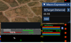
Well poop.I'm using the latest zliz (obviously), and my distance works as expected.
no changes were made to the group window, so i'm not sure what to tell you
View attachment 50529
Something wrong on my end then I'm sure.
Thanks guys, guess I'll do a whole wipe and reinstall windows as I'm having some other minor issues.
Appreciate it!
BB~
UI looks pretty slick. Really like it and how it fits in with the Lua components. I've dabbled in modifying UIs in the past to make them work, but what would it take to increase the size of the Group, Player, Target, Pet, and Xtar windows by 15-20%? I run at 1440 on my main account and the boxes are set to 1080p. This fits in great on the boxes and gives room. On the main though would be great if those components were a bit larger for old eye visibility and not getting dead. Understanding this is maintained and provided as a kindness, any chance of a secondary folder with alternate components for higher resolution?
Thanks for reading.
Thanks for reading.
- Joined
- Jul 22, 2018
- RedCents
- 2,746¢
making any individual element larger is pretty trivial, you just open up the .xml file and find where it defines <size> and change the values. What you really want, though, is to adjust the actual font size. Since the same size font in a larger window isn't going to be any easier to read. Font size, unfortunately, is not universally configurable. The game has settings for chat font sizes built into the client, but you can't alter the fonts of the UI elements themselves.UI looks pretty slick. Really like it and how it fits in with the Lua components. I've dabbled in modifying UIs in the past to make them work, but what would it take to increase the size of the Group, Player, Target, Pet, and Xtar windows by 15-20%? I run at 1440 on my main account and the boxes are set to 1080p. This fits in great on the boxes and gives room. On the main though would be great if those components were a bit larger for old eye visibility and not getting dead. Understanding this is maintained and provided as a kindness, any chance of a secondary folder with alternate components for higher resolution?
Thanks for reading.
Supposedly, one of the features of the promised UI revamp is the ability to scale this sort of thing for high DPI monitors. But that is buggy AF and not getting any better quickly.
Sic updated Zliz - Sic/Kaen version with a new update entry:
Now with Persona Button
Read the rest of this update entry...
Now with Persona Button
Now with Persona Button
Read the rest of this update entry...
Sic updated Zliz - Sic/Kaen version with a new update entry:
Bag changes
Read the rest of this update entry...
Bag changes
- Allow for bag slots to be colored again (mqitemcolor, etc)
Read the rest of this update entry...
Whoopie!Sic updated Zliz - Sic/Kaen version with a new update entry:
Bag changes
Read the rest of this update entry.
Sic updated Zliz - Sic/Kaen version with a new update entry:
bag slot adjustment
Read the rest of this update entry...
bag slot adjustment
- bag slot adjustment for colors
-- if you're using mqitemcolor check out turning on the "glow" texture in the itemcolor settings
with glow
View attachment 54145
without glow
View attachment 54146
Read the rest of this update entry...
If y'all haven't checked the "Updates" tab at the top and seen that Sic mentioned mqitemcolor and the glow feature; do so. Just another of the many many things I didn't know I needed until I saw him post about it. Absolute game changer when looking for stuff in the many bags we all have.
A MUST have.
BB~
A MUST have.
BB~
Sic submitted a new resource:
Zliz - Sic/Kaen version - Sic & Kaen's version of Zliz
Read more about this resource...
Is it possible to also have the spell gems I see you using in all the CWTN videos? those looks NIOCE. I got Zliz in UI just fine but its the standard EQ spells gems. Thanks!!!!
this ui is the ui i use.Is it possible to also have the spell gems I see you using in all the CWTN videos? those looks NIOCE. I got Zliz in UI just fine but its the standard EQ spells gems. Thanks!!!!
Users who are viewing this thread
Total: 2 (members: 0, guests: 2)
Share:

